#ChalkFIT

For those who don't know, I attend FIT (The Fashion Institute of Technology in NYC) for Illustration. Earlier this week, we Illustration students participated in a cool event that a professor of ours created. He's a new faculty member and he's doing so much for us and our program, which all us students are super appreciative for.

For a few weeks now, we senior class have been planning designs to do chalk art on the panels outside of our school to promote Homecoming as well as our Illustration program.

I'll be honest, I was dreading it. I hate people watching me as I do my thing, but when the day rolled around, it was actually exciting. Our school security roped off the area so students could work without being too distracted by passerbys.
As the day progressed, we all made headway and our nervous and anxious feelings disappeared.

It was interesting to see the kind of folk that passed by while we were working for 8+ hours outside on a busy street. We had plenty of people ask about the event, the chalk and materials, and directions from tourists. There were some creepy moments, and other hilarious ones.

We got dirty, extremely dirty, but it was all worth it. Working out in the cold for so many hours did us good by placing us in a situation we never thought we'd be in and enjoy so much in the end. I actually kind of miss that feeling of working out in the open and conversing with people who stopped to observe and compliment us all.

Aside from those passerbys, I was interviewed twice (which I embedded at the bottom of the post).

Overall, it was a great experience and great exposure on everyone's part. I can't wait to participate in future events that will be as much fun as this.

Here's that video I mentioned. I was interviewed by a Chinese station, I wish I took down their information, or at least understood the language to figure out what they're saying!

You can find more photos in Instagram and Facebook under the hashtag #ChalkFIT. Everyone did such a wonderful job!

Birthday Trip To The Moon

First of all, how is the new layout? I've been wanting to change it for some time. I missed the simple post layout with a constant reading flow; got a little tired of seeing the thumbnail to 'read more'. Took me some time to find a new layout and jazz it up. But I think I finally got it.

Anywho, my first project for one of my classes this semester was to create an image that represents "adventure". I wanted to do a space scene. I sketched out a couple of ideas and thought to do my version of a "Trip To The Moon" - two friends taking a trip to the moon to celebrate a birthday.

I inked out the earth which I used mosaics as inspiration.

I colored it in - watercolor and colored pencil.

I decided to do it on wood. I painted it black with chalkboard paint. I glued the earth down and then created my rocket ship and moon, and splatter painted the galaxy bit.

The majority of the subjects were watercolor and colored pencil. I made it a super duper mixed media piece; I incorporated thread to represent the fire coming out of the rocket, and thread and magazine scraps to create the flag decoration wrapping around the moon.

My professor showed us the Georges Méliès film last semester and I guess it just stuck with me. Here's the colored and rescored version featuring Air in the soundtrack.

Wishlist Wednesday // 005

01. Sony Cyber-shot RX100 - I've been dying for a new camera. I was interested in investing in a DSLR, but I'm a simple person with simple needs; I basically like point & shoots. A friend told me about this amazing camera, and after seeing photos other people have taken, and even testing it out in person, I've concluded this is the camera for me. Maybe someday soon I'll think about going for it.
02. Malachite Spec Laptop Case - Speaking of investments, I mentioned I got a Macbook, right? Being that it's brand new and pretty damn costly, I obviously want to take good care of it. Can I has forest green case, please?
03. Kuzy Keyboard Cover - On the topic of jazzing up but protecting my computer, I think this light pink keyboard cover will look nice with the green case.
04. Dirty Laundry Ratatat Boots - I came across these clear faux-Docs boots that I think would be so much fun to wear. I adore fun socks and these boots would show them off for sure. And they seem effective for winter and rain.
05. Mermaid Shampoo & Conditioner - Browsing through other blogs, I've read a few reviews for this shampoo and conditioner and I've concluded that I'd LOVE to smell like a mermaid! I have an idea of what a mermaid's scent it (no, not fish) and I've read that the scent is what you'd imagine to be. I want to give this a try for sure.

And to cover my music of the moment, Keep Shelly In Athens released amazing new music last month. This is their recent music video. Amazing, amazing.

Minty Label

I created my first packaging label design! (Which is not a real label that you'd be able to find in stores, just make note.)
The assignment we just finished for our general illustration class was so scattered. Every student assigned another student a project; everyone got to play the role as the art director and illustrator. I was assigned to do a label design for a product that was picked for me.

The sizing and specifications were included: the only two colors were this minty green and white (with variations of grey), two hands holding garlic on a rope creating somewhat of a symmetrical piece, and a decorative border around the product name.

A jar top was also part of my assignment, including garlic and more decorative elements with the same color scheme.
All of it done in handy dandy Photoshop.

I went the extra step to print out the label true to size and glued in on a container.

After coming home from the critique, I didn't know what to do with the container, so I put all my sewing pins and whatnot in there. All fits perfectly. I'm just happy I'm putting it to constructive use.

And as I finished typing this all up, I experienced a serious case of déjà vu. Seriously such a strange phenomenon.

The Birthday Llama

Aaaand, I'm back. I've been absent for a little over a month mainly because this semester has been so time consuming. Aside from school projects, I've had a lot of projects and such that I've been working on in my spare time, which I definitely will talk about in future postings. And in between all of that, I have become a proud owner of a Macbook Pro! I think I've mentioned in other posts that I've had such desktop issues this year. I finally gave it up, moved on, and invested in a Macbook that I plan on using as my one and only computer. So far, no complaints at all!

So with all that being said, I should be getting back on track with posting regularly, and maybe even finally getting back into my weekly posts that I have so badly neglected in 2013.

To the topic of this post, the past two months have been birthday central for friends and family, and I wanted to share a little gift I put together for a friend of mine.

Long story short, we're taking a book illustration class this semester. Aside from the fact that she adores llamas, the story she wrote is about a llama who loses his stripes. I thought it'd be cute to make a striped llama on her shirt in connection to her story.
His name is Jake.

I added a pink llama friend to match the stripes and mint colored shirt.

I sewed on buttons for eyes, and embroidered a nose and mouth, while swapping fabrics for their ears.

And there you go, a llama shirt.

Type & Logo

Typography has always been an interest of mine. I used to draw/copy band logos, make my own type, draw type on shirts, yadda yadda. My friends think it's one of my specialties. As much as I see how much they believe so, I surely don't agree because the world of typography is so precise, detailed, and complicated. But those facts won't stop my interest in type from growing.

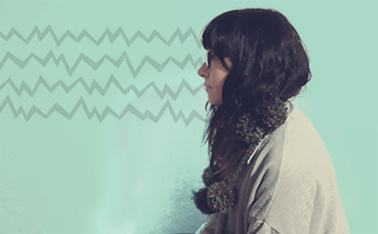
I just finished my second week of classes. This semester is already underway, and I have to admit I'm excited. For this workshop class I'm taking, we were assigned to make and develop our own logo throughout the semester. Where do you even start with your own logo? Sometimes you just have to go with your gut and just make the first thing that comes to mind. I created a line drawing of my cat eye glasses and originally added a zigzag on top of my glasses to "represent" my bangs. After some tweaks, I made those zigzags spell out "mars".

Straights and curves make up lines, and those lines make sketches and drawings, graphics, typography, etc. Typography is graphic; graphics make up typography. It's astonishing, really.
A while ago I came across this quiz: What Type Are You.
My result was Universal, with characteristics of rational, understated, progressive, and relaxed.

I dig it.

After some web browsing today, I came across some typography websites and this cool type video. Enjoy.

Alphabet in motion - Barcenova type from Cecilia Brarda on Vimeo.

Diver Revisited

I think I made it clear at some point that last semester, I went through an aquatic illustration phase, right? Well, it happened. I just came across another Photoshop piece I did for my digital class last semester. This was the last deep sea diver piece I made.

For this piece, I wanted to play with line and space. I didn't want to go too crazy with the subject matter so I chose a simple 3/4 portrait view of a deep sea diver suit.
When I was pitching my idea to my professor, he recommended I look up the artist Shaun Tan. I pulled up Google, browsed through his work, and I fell in love with his art. His work is so soft, and so strange, and I love his rendition of the diver suit.

I browsed Google some more and found a short film that's based on his book "The Lost Thing". There is something about short animated films that are so amazing and so unique compared to full movie length animations. And I wanted to share this one because it's so damn charming.